Task:
Result:
A truly breakthrough, unusual, memorable personal account interface was designed, at the same time understandable to a wide audience (as shown by focus groups).

The main screen of the personal account reflects the concept of "one personal account for several SIM cards". The central part is reserved for the balance from which the SIM cards branch out.

When you click on the SIM card, a nice and understandable context menu starts to hover around it.

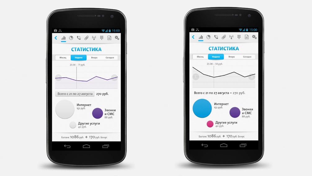
One of the most beautiful screens in the application is statistics. The circles show the total expenses for different services and are at the same time service selection buttons. Moreover, the size of the circle depends on the amount of spending for the selected period of time.
Together with User House, we are working on our company's landmark project. We've already completed the prototyping phase, which is surprisingly fast given this type of project - all thanks to the team's depth of knowledge and expertise in this field...
Together with User House, we are working on our company's landmark project. We've already completed the prototyping phase, which is surprisingly fast given this type of project - all thanks to the team's depth of knowledge and expertise in this field.
The graphic design phase, particularly, was a nice surprise. Initially, we planned only to use User House services to render some secondary segments for the project and outsource the job of creating a concept and graphic design for key segments to agencies in the UK. However, the User House team proved to offer design quality that was on par and sometimes superior to that which the British agencies could offer. And so we went with the style and graphic design proposed by the User House team. The product turned out to be very useful and stylish. Thank you guys and keep up the great work!

Share
Other projects on wireframes and prototypes


