Task:
Result:
We went to production, figured out the technology, dived deep into the subject area as much as possible and designed the most understandable and informative order interface.
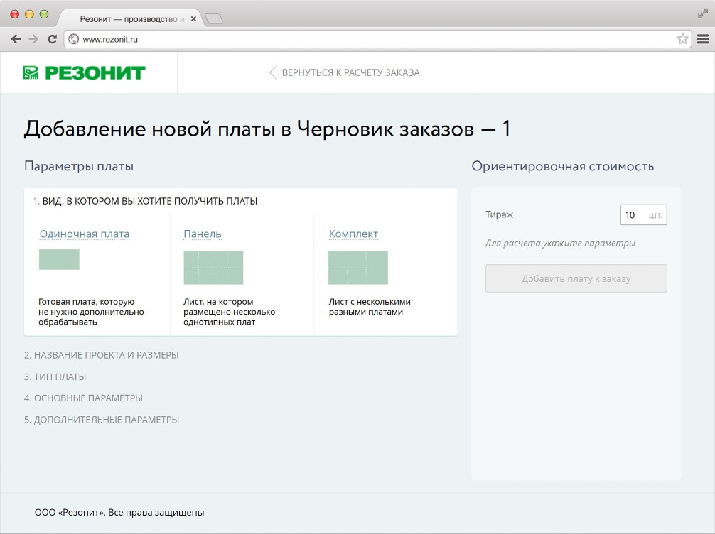
From the very first step, the interface tries to explain each order option in as much detail as possible. For example, on this screen, the difference between a single board, a panel and a kit is not only clarified in text, but also illustrated graphically.
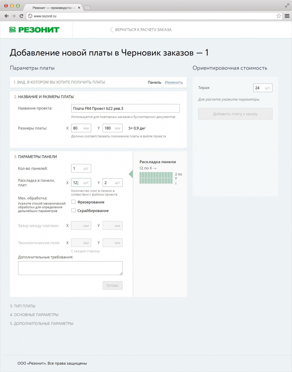
We visualize information wherever possible to dilute the gigantic number of digital order parameters and improve the data readability
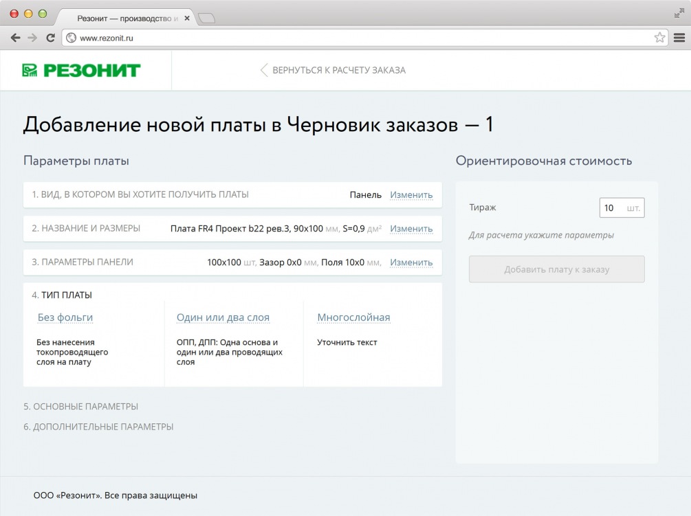
We also use the "accordion" method of implementing forms, when each of the sections collapses into a compact panel, after filling it out, which allows you to see the key parameters of the order on one screen and, if necessary, to quickly edit them.
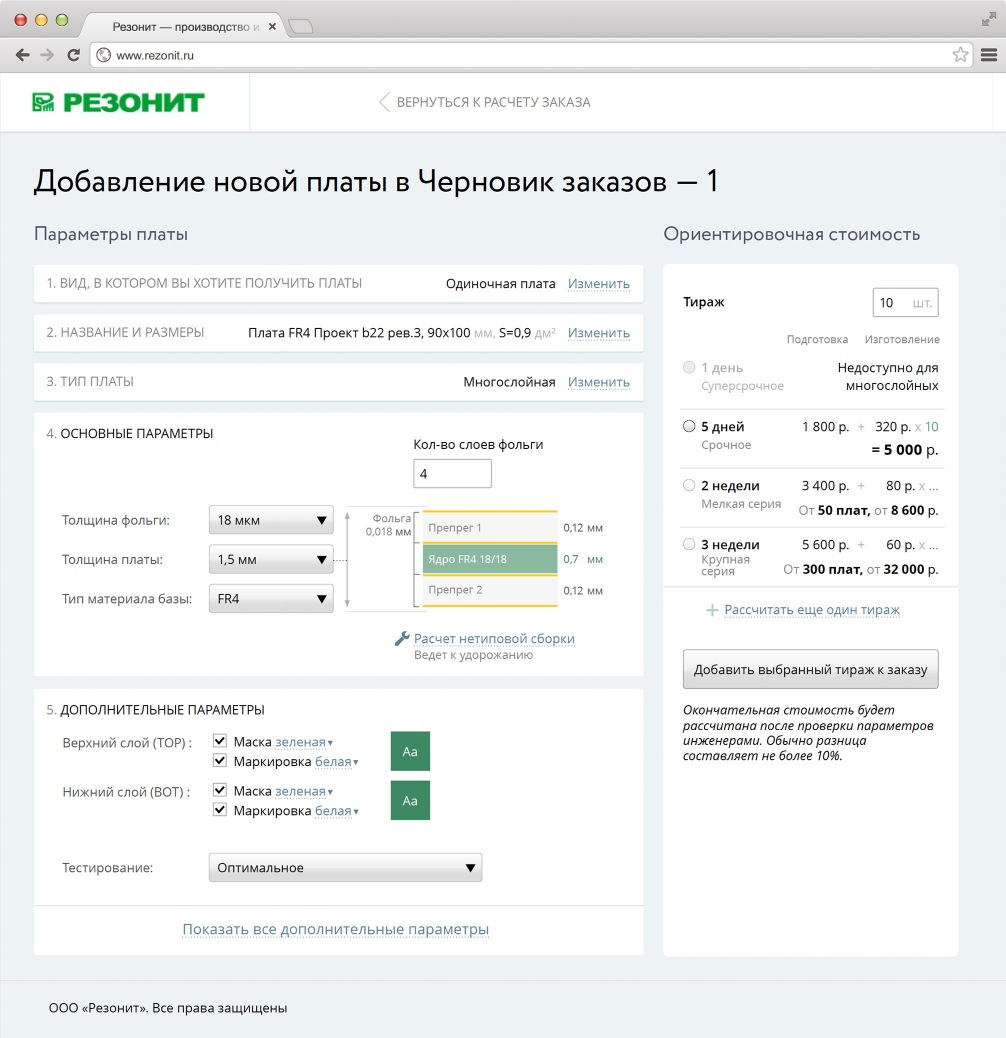
The estimated order cost appears as soon as the required parameters are entered. Moreover, the user immediately sees the dependence of the cost on the urgency of execution. The interface also informs about the final cost: “The final cost will be calculated
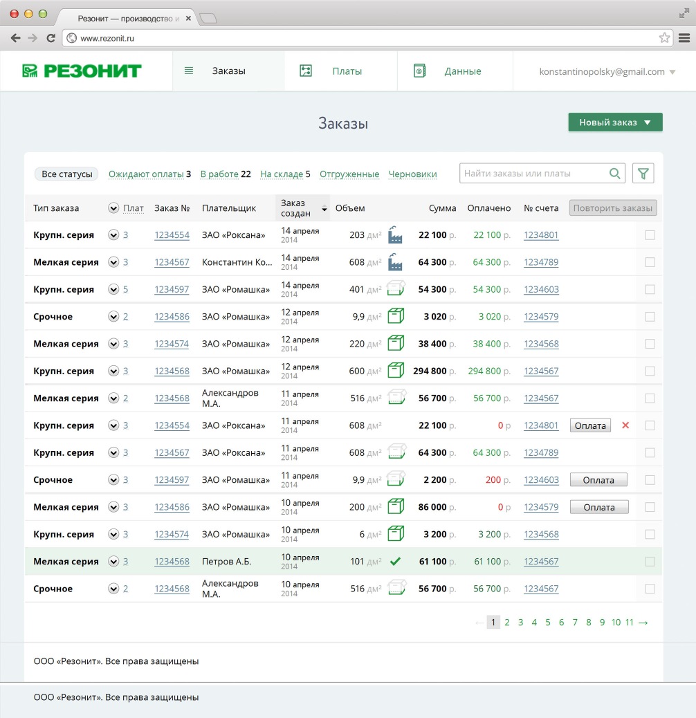
The order list simply and clearly shows the stage of completion of each order.
Share
Other projects on wireframes and prototypes

