Task:
Result:
In just two months, the entire partner's interface was designed (67 pages).

Platforms - the main screen that the affiliate works with, in a compact form reflects the most important information on all sites.

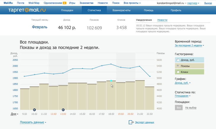
"Statistics" visually displays the overall statistical information for all sites on the current values: income, impressions, clicks

Transparency and detailing of mutual transactions between partners are a guarantee of long and fruitful cooperation
Process:
We start with the home page. We decided to focus on why everything is done - how much the owner of the site earned.

Fine, but is it difficult to track the dynamics - “This week we earned more than last? And this month? " Plus, the customer asks to display not only earnings, but also impressions, clicks, CTR. We added the required values and the ability to compare figures with past periodsv.

We place information in two lines, the first is fixed: with statistics for the current month, the second - with a filter: for yesterday, for today and a new idea: forecast for the end of the current month.
Customer: “Yes, you came up with a good filter, we leave it. And one more thing: do we have our advertisers service pages ready? It is necessary to maintain continuity when designing an affiliate network.
Therefore, the main page is not needed, the "Platforms" page becomes the landing (by analogy with advertisers and “My ads” page?
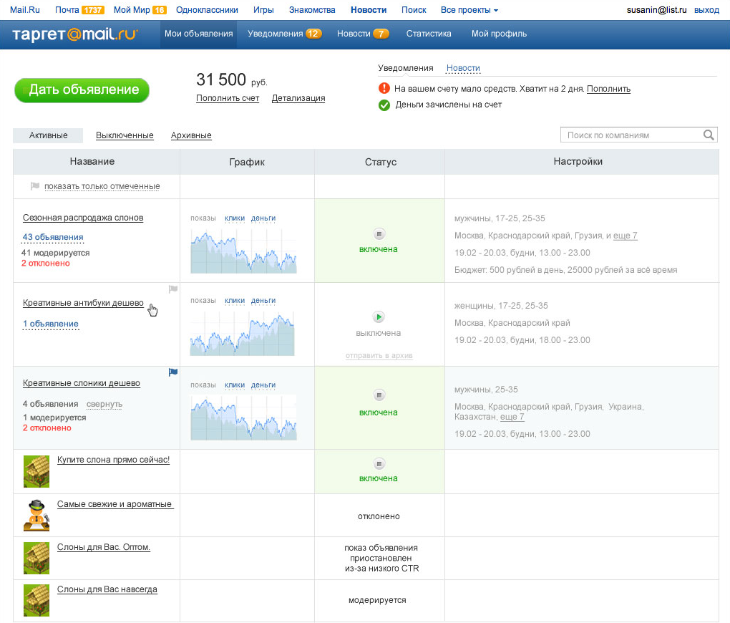
It is necessary to combine 3 pages: to preserve the user's ability to evaluate his earnings from the main page; all content from the "Platforms" page; and to transfer the page building format from the "My ads" page (on the advertisers’ service).


As a result, we get a completely new “Platforms” page.
We pay great attention to histograms with statistics. We are trying to find a display format that will be visual in different conditions. We take into account that any of the values can be displayed on the chart: impressions, clicks, CTR, cost per click, earnings, and also that the data can be grouped by any of the periods: day, week, month.
First approach:
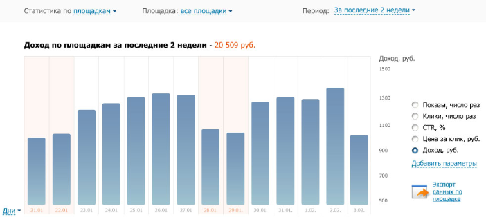

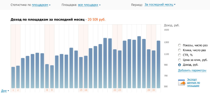
In the process of working on the type of histograms, the customer adds the request to see several values on one chart at once. We are looking for ways to combine data.

Art director: “It won’t work – to build such a graph for 3 months for three values and then to try to figure out the result. It is necessary to remove the massive fill of the columns, to make it easier, but increase the emphasis on the upper border of the column. And it is necessary to display the values one above the other, so that you can track the dynamics for each."

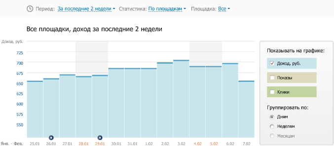
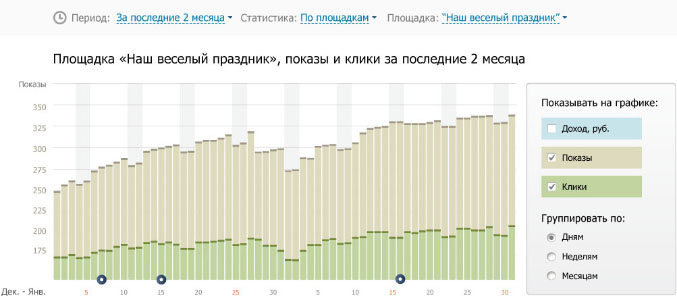
Designer: “I did it. Changed the display type of several values on one chart and changed the display of each column. Now the trends are seen much better, regardless of the selected time period. "
Customer: “It won’t work. It may seem that the upper chart "stands" on the bars of the lower one, which means that the upper level reflects the original situation. Let's do what advertisers do - a bar chart for one quantity and a line chart for the other. "
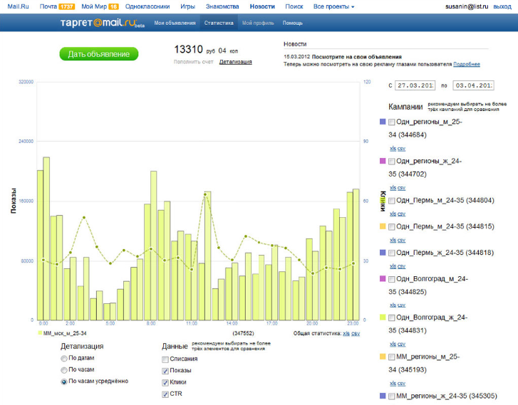
We draw the final version, taking into account the wishes of the customer.
Work on the "Help" section was no less interesting.
Customer: "We want the user to be able to solve their questions on their own and to only use contact the support service as a last resort option."
Us: We propose to combine all methods of solving the user's problem on one page, focusing on the already written materials.
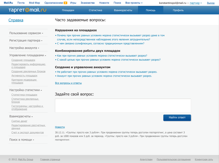
The central place is occupied by a list of frequently asked questions, on the left is a section of detailed help, below is a form for asking a question.

The innovation is that when the user has entered their question, the system analyzes it and offers relevant help topics.
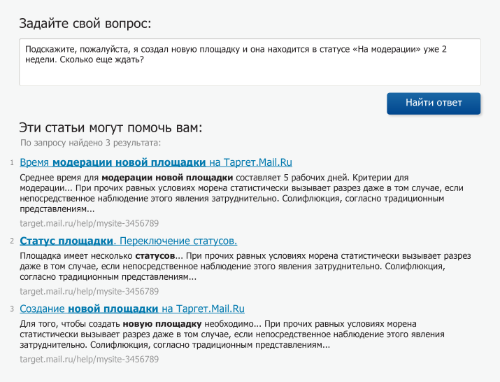
If this does not help to solve the problem, the user can contact the support service. The form for sending a question to the support service goes immediately after the list of links.

Thus, we increase the likelihood of the user solving the problem on his own and reduce the load on the support service.
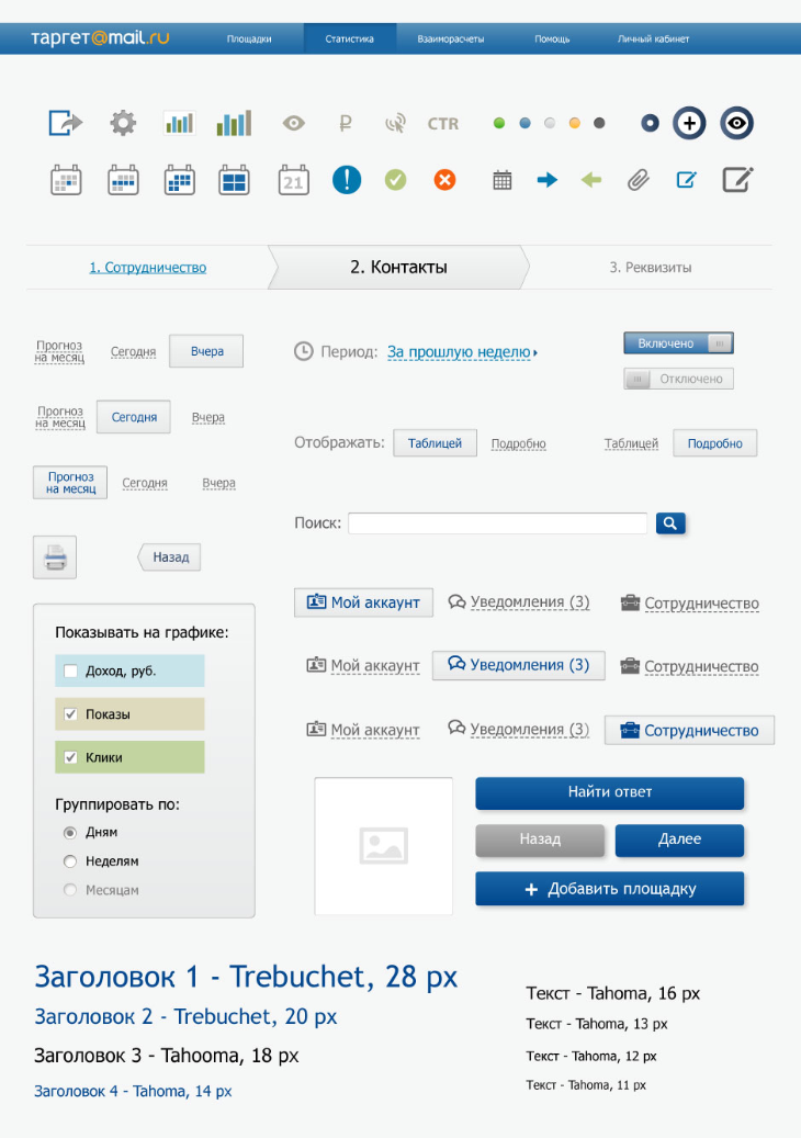
The customer asked to make not an early prototype, but provide a graphic design of the interface. The details were treated with love and attention.
Share
Other projects on wireframes and prototypes
